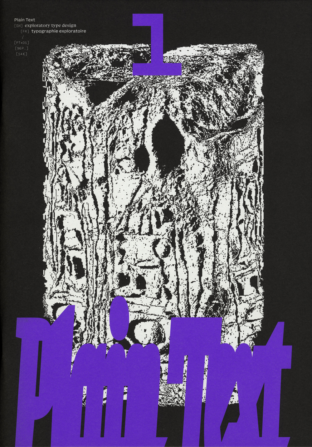
14€ –
Plain Text 1
A printed publication for exploratory type design published by Plain Form. Scheduled for delivery around end of 2024, beginning of 2025.
Plain Text 1
a printed publication for exploratory type design
published by Plain Form
From fiction to theory, from mystical analyses to visual works, Plain Text aims at exploring typographic imaginaries, moving beyond a strictly historical and technical framework, with a taste for the unknown and the dormant potential of writing.
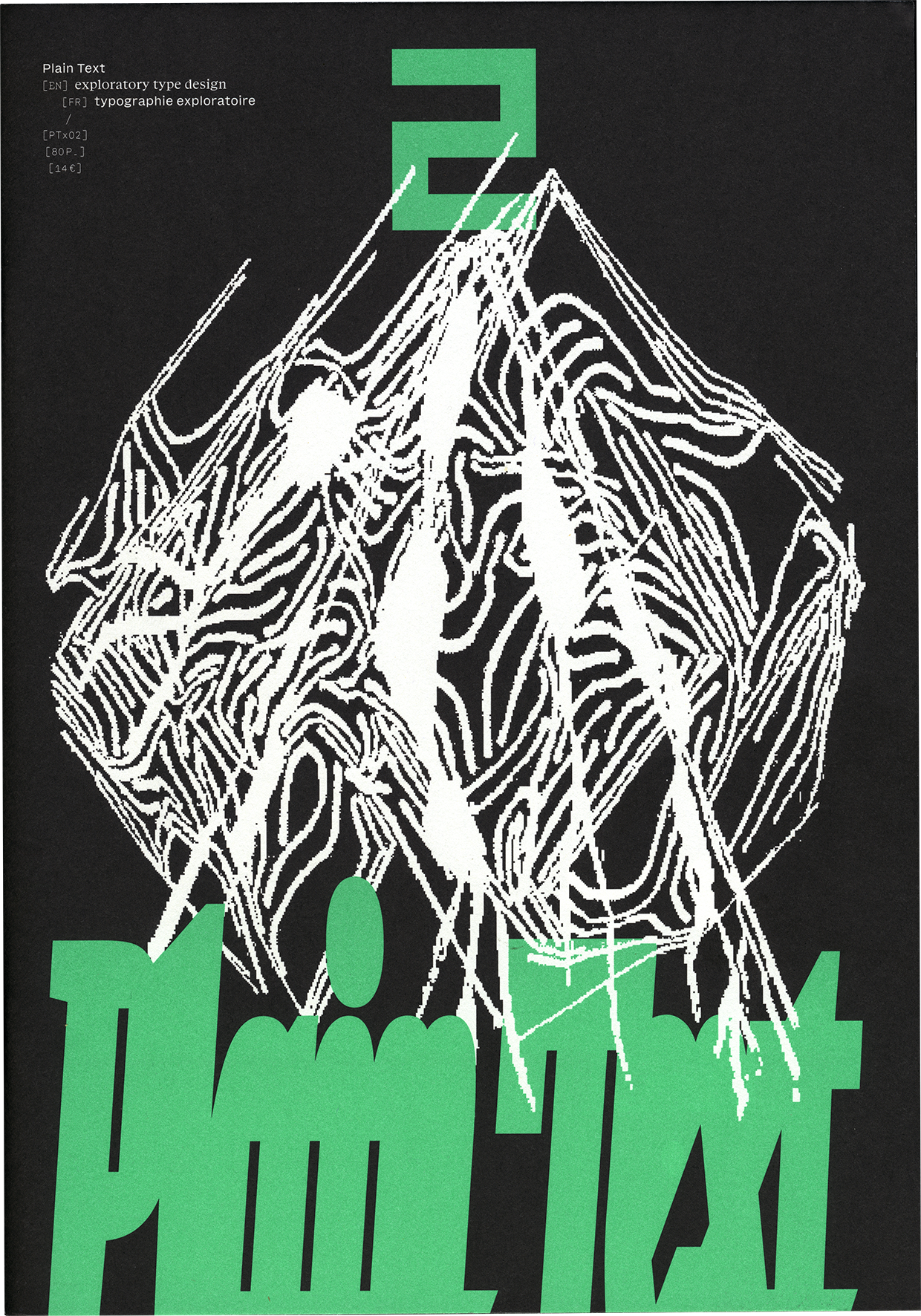
Each issue features diverse content — essays, interviews, portfolios, re-publications, fiction as well as visual works — to satiate both type design experts, with contributions from or about recognized practitioners just as well as recent students, and the generally curious, with insights valuable to anyone interested in language and communication. We defend a poetic vision of type design and aim for Plain Text to be a space where letters are free from utilitarian expectations, allowing designers, writers, and typography enthusiasts to share trials, doubts, successes, and failures, contributing to a theory of type design that is poetic, eclectic and federated.
“Those glitchy and noisy moments of type design really grab me; the thousand undiscovered universes embodied in them, breaking the binary state of reading and writing and expanding the gorgeous garden of communication, with new paths forking in front of our eyes.” Eager Zhang, Shape of a Thousand Universes.
The first issue of Plain Text features voices from various backgrounds and generations, many offering a personal, even intimate or spiritual, approach to letters. Dr. Kirsten D. Dzwiza, an expert in the archaeology of ancient magic, explores the historical perspective of producing and receiving written language, while Ayasha Khan and Eager Zhang bring contemporary views, questioning the boundary between text and images through studies of emojis or the creation of typefaces to complement poetry.
Between text and image, lies the use and design of patterns, a key interest of Zuzana Licko, explored in a series of “extended captions” of her projects, blending non-typographic elements into letters and applying typographic concepts to other creative means. Letters are seen as signs in a system, detached from their usual role of conveying information. This theme is also central in our conversation with Stefan Ellmer of The Pyte Foundry, who shared his research on asemic writing, exploring this peculiar writing practice and its connections to type design.
Other contributions explore type design as an experiment, involving empirical processes and hypotheses — some purely aesthetic, others focused on ingrained habits, like the creation of type families. This first issue of Plain Text encourages a fresh look at familiar concepts, connecting seemingly unrelated fields to uncover new facets of our writing systems. There’s also something about how typography might be the work of the Devil — but you’ll see.
“Today we tend to regard writing as an ingenious human invention to serve human needs. This was different in antiquity. Script, signs, and writing had additional, metaphysical, religious, and magical dimensions. They weren’t perceived as mere tools to squeeze language into an analogue sequence of characters.” Dr. Kirsten D. Dzwiza, Ancient Mysteries of Writing.
Summary
Summary
For this first issue of Plain Text, we are thrilled to announce works from:
- Anne-Dauphine Borione (→ daytonamess.com)
Trust the Process
Peeking into the daring, epic and experimental mind of Ando aka Daytona Mess. - Ayasha Khan (→ @_aykhan)
Emomania
A generous and fascinating portfolio, exploring the border between writing and drawing. - Benjamin Dumond (→ grifi.fr)
Typography as a Labyrinth
On what it means to experiment and what experimental type could be. - Eager Zhang (→ eagerzhang.com)
Shape of a Thousand Universes
A non-utilitarian perspective on typography to embrace its complexity. - Dr. Kirsten D. Dzwiza (→ antikemagie.com)
Ancient Mysteries of Writing
Diving into the magical perception of writing in antiquity. - Lucas Descroix (→ lucasdescroix.fr)
Family Friendly
Exploring non-standard ways of constructing typographic families through the use of parables. - Stefan Ellmer (→ thepytefoundry.net)
Asemic What?
A discussion around asemic writing and the perspectives it opens up for type design. - Tezzo Suzuki (→ tezzosuzuki.com)
The Fourth Sister of Character Design
A reverie on what might come after typography as a form of writing. - Zuzana Licko (→ emigre.com)
Weavings
How to apply type design mechanisms into other fields, and vice-versa.
“Recognizing a smily face, or letterform created within an eight by eight grid, or perceiving the color yellow, blended from red and green light emitting diodes illuminated side by side, is some sort of magic, scientifically explainable, but not undoable by explanation.” Zuzana Licko, Weavings.
Publication
Publication
Fabrication
Plain Text will be printed in Lyon, France, where we live and work — we like the idea of a local production. We estimate the release date around end of 2024, beginning of 2025.
- Bilingual publication (English / French)
- 210 × 297mm, 100 pages
- Inside: black offset printing on Munken Print White 80g
- Cover: black + Pantone offset printing on Munken Print White 115g
- Selling price: 14€
Technical detail for those of you who are into it, Plain Text is entirely designed in the browser using web-to-print tools, such as Paged.JS and Bookolab.
Distribution
Plain Text is a recurring publication, published twice a year. It will be sold through Plain Form, on a platform dedicated to printed objects. We are also in contact with a few selected book stores and cultural institutions in France and other European countries, where we would like the publication to be available. If you have such a place and would like to see some Plain Text on your shelves, feel free to get in touch, we’d love to hear from you!
Credits
Credits
Plain Text is edited and designed by Lucas Descroix and Benjamin Dumond, and published by the type foundry Plain Form.
Plain Form
Plain Form is an independent typographic practice, established in 2022. We focus on expressive letterforms, meant to be seen as much as to be read. We perceive type as a fascinating raw material for culture and strive to constantly question its established standards, drawing lines between the discipline’s rich history and its ever-expanding potential for novelties.
Lucas Descroix
Trained as a graphic designer, Lucas fell down the typographic rabbit hole after a post-master at the National Institute for Typographic Research (Nancy, Fr). Since then, he’s been drawing shapes and building systems — often creating atypical type families, relying on contrast and sensibility rather than cold logic. Lucas created Plain Form in 2022.
Benjamin Dumond
Graphic designer, developer and founder of Grifi, Benjamin explores textual potentials through essays, fictions, tools, thought experiments and typefaces. His approach to type design is uninhibited and unconventional, with very little amount of drawing, a whole lot of distortion and a generous sprinkle of occult.
Thanks
Immense thanks to all contributors! Thanks also to, in no particular order, Elenor Kopka, Véronique Ancelet, Thomas Huot-Marchand, Alaric Garnier, Julien Loth, Antoine Perchat, Yann Trividic, Julien Taquet, Alex Slobzheninov, Loup Cellard and Lucile Haute, for their time and support, in various amounts and at various stages of the project.